Orro: Transforming Light into an Experience
Orro is a responsive home lighting system that detects your presence and adjusts automatically to mimic natural patterns of lighting, reducing the artificial light exposure that disrupts your body’s circadian rhythm.
CHALLENGE > APPROACH > RESULTS >
SERVICES
Industrial Design | Branding | Packaging | Art Direction | Naming Systems
INDUSTRY
Consumer Technology | Smart Home

CHALLENGE
Elevate every moment
We partnered with Orro to develop a holistic brand experience, including their brand name and visual identity, and the design of their first product: the responsive light switch. Each touchpoint needed to deliver on Orro’s mission to transform light into an enriching home experience.
APPROACH
Timeless, well-made, and intuitive
The connected homes of today are ever-evolving environments. However, most people only expect to change their light switches out every five to ten years, if not longer. This understanding guided our design process — a light switch, even if it is a smart product, still needs to feel timeless, well-made, and intuitive.
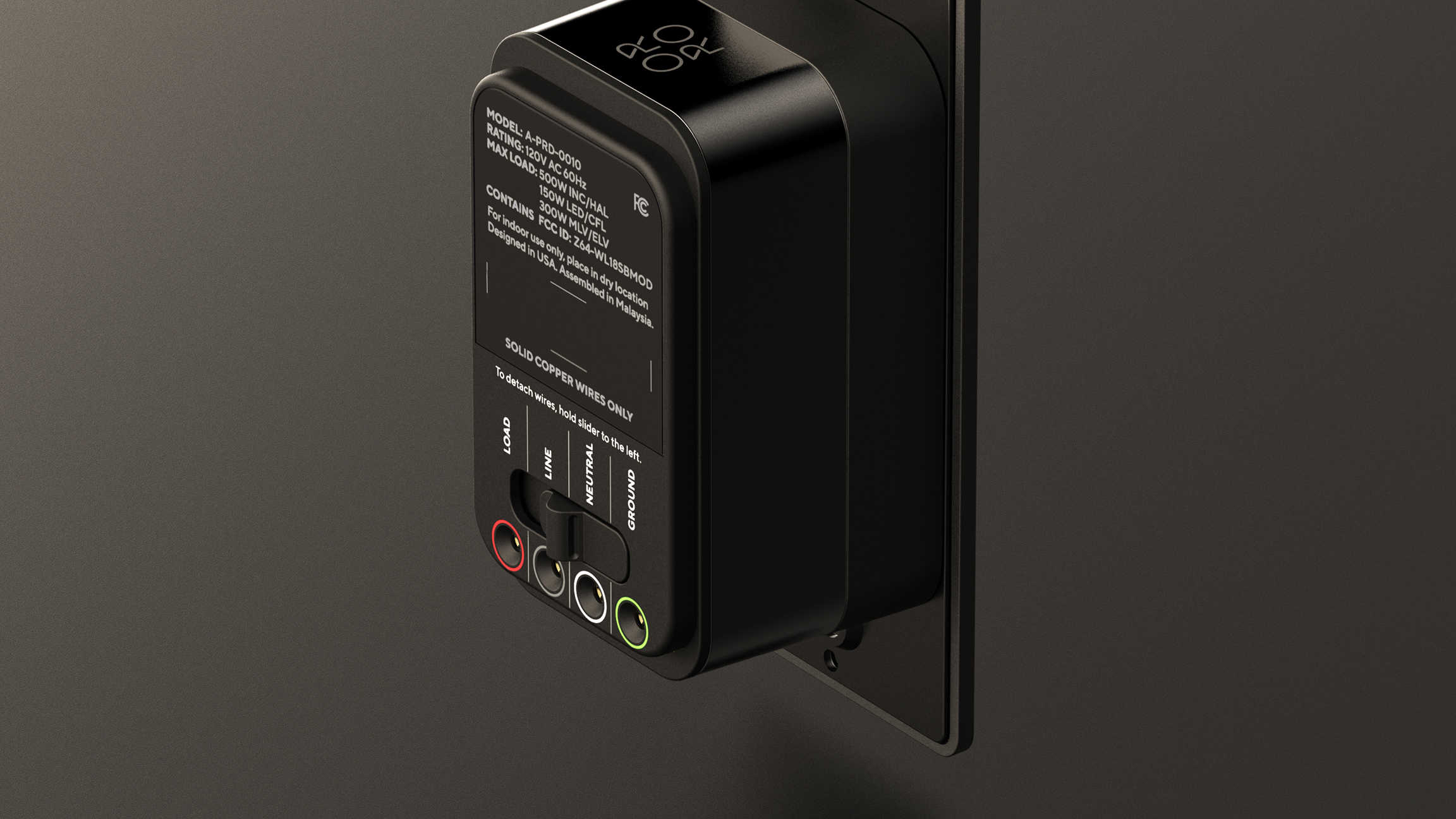
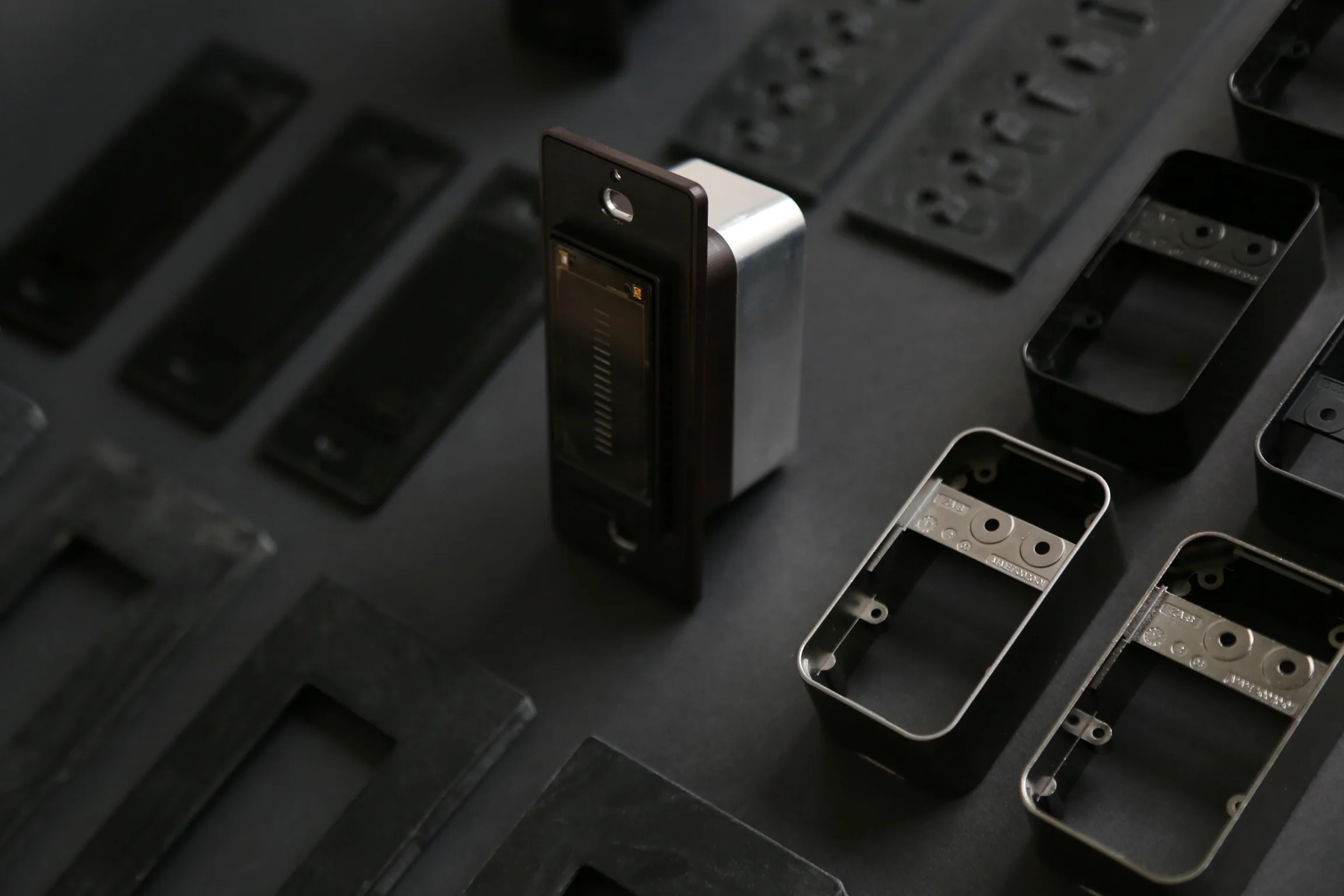
Additionally, we focused on installation. Light switches, traditional and smart, often require complicated setup processes. We designed Orro to simply plug into the wall and need nothing more than a neutral wire. It works with all light bulbs and existing switch boxes.
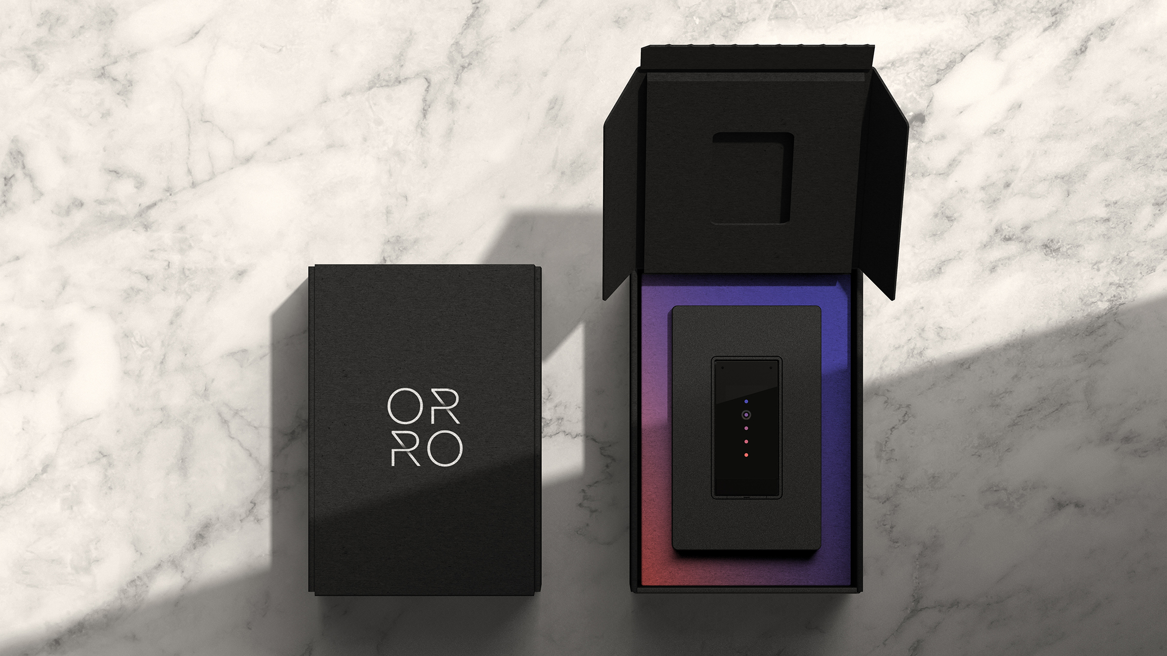
RESULTS
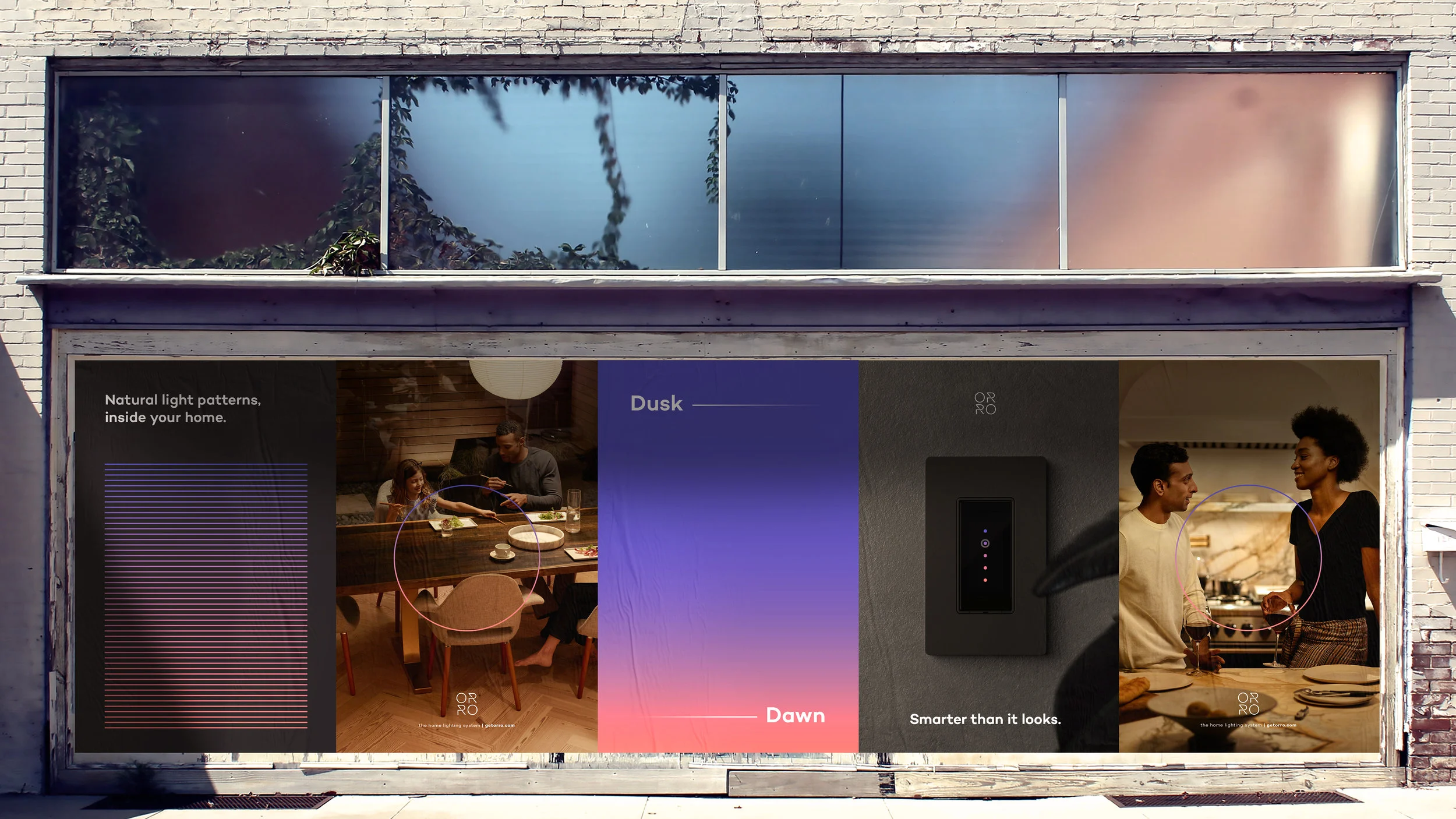
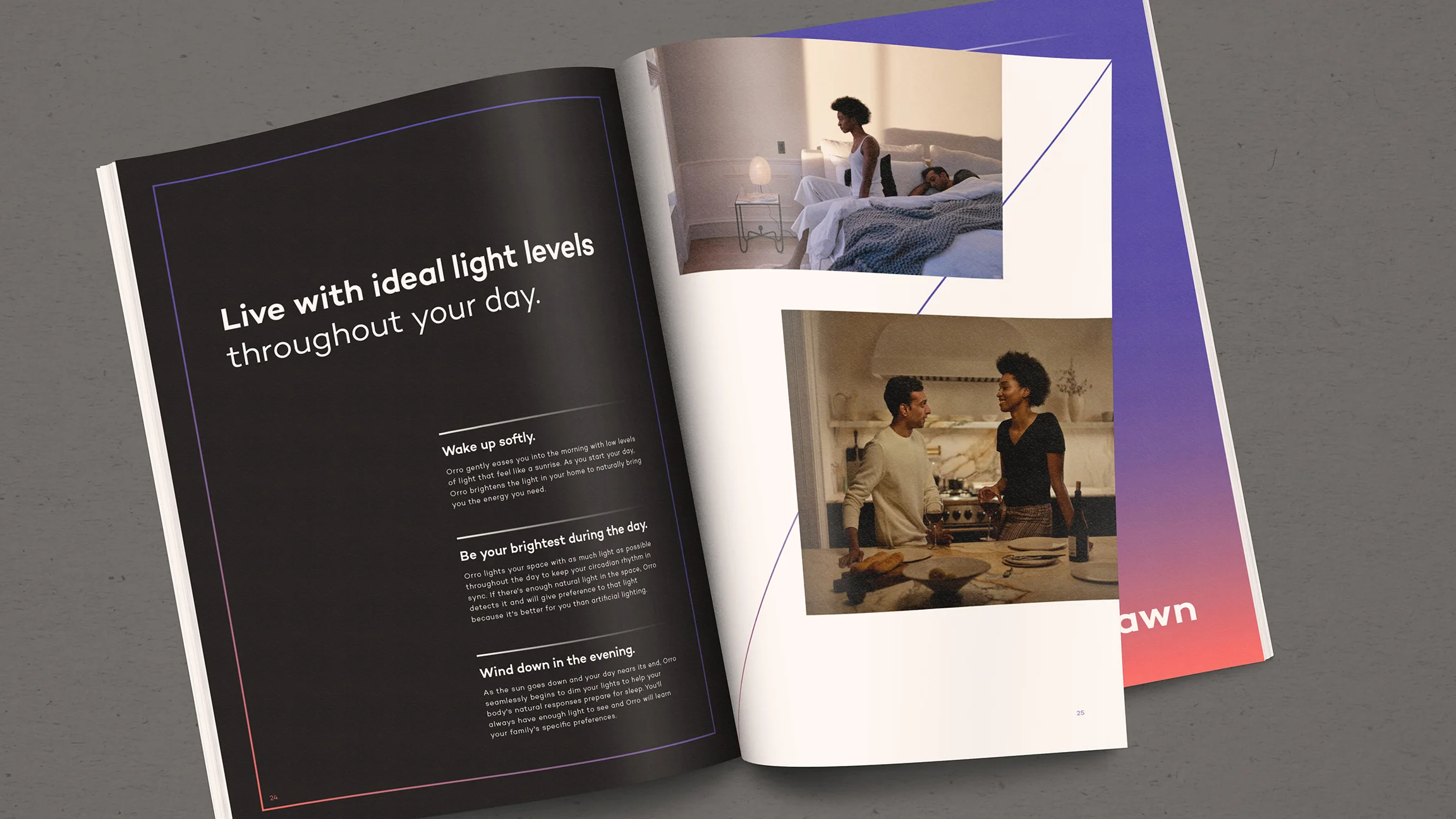
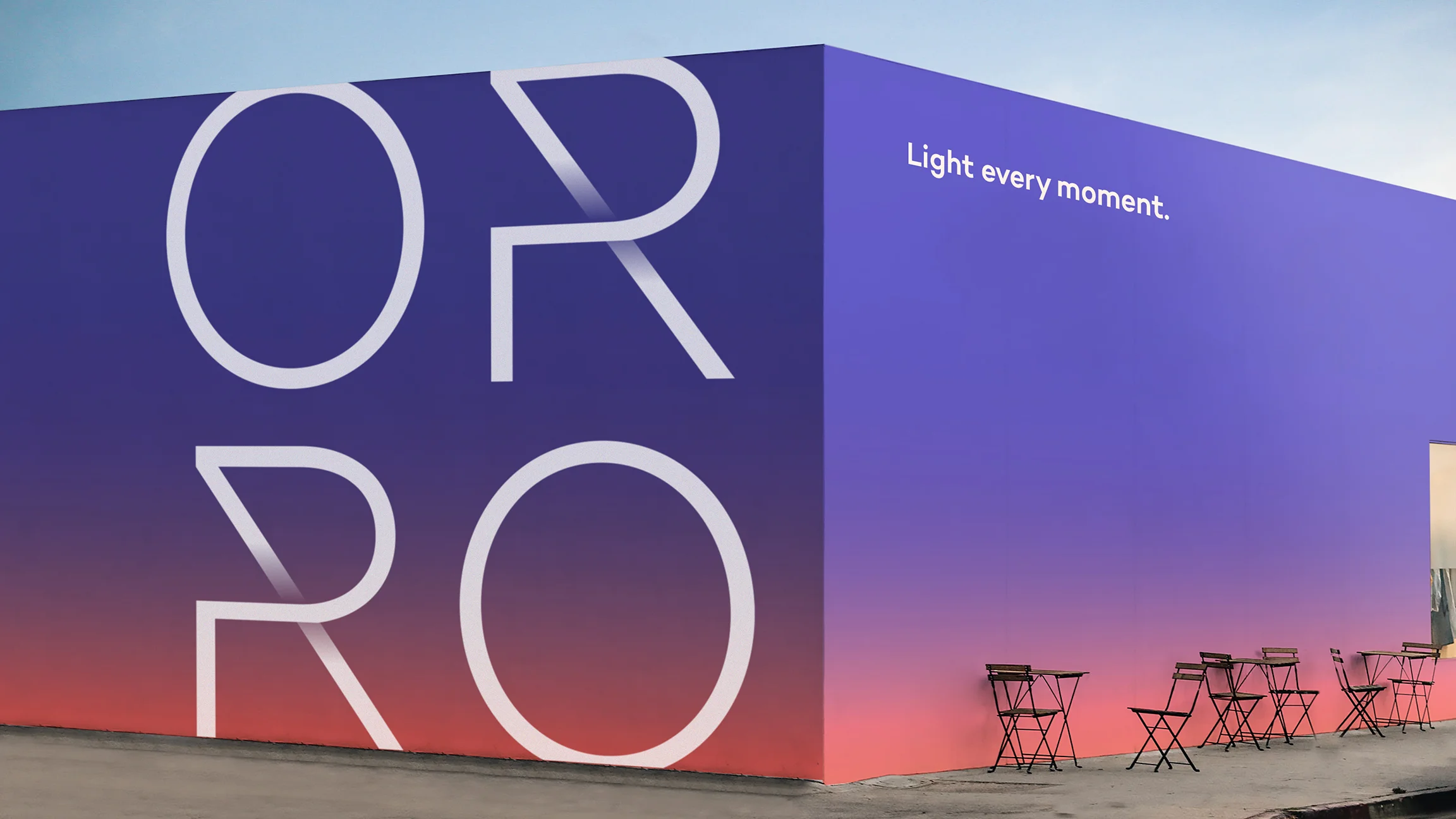
Golden hour
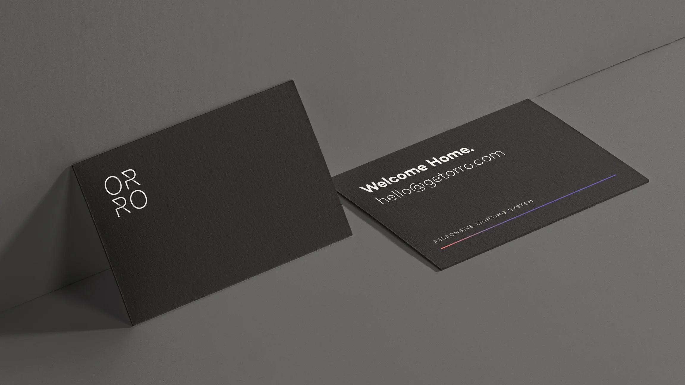
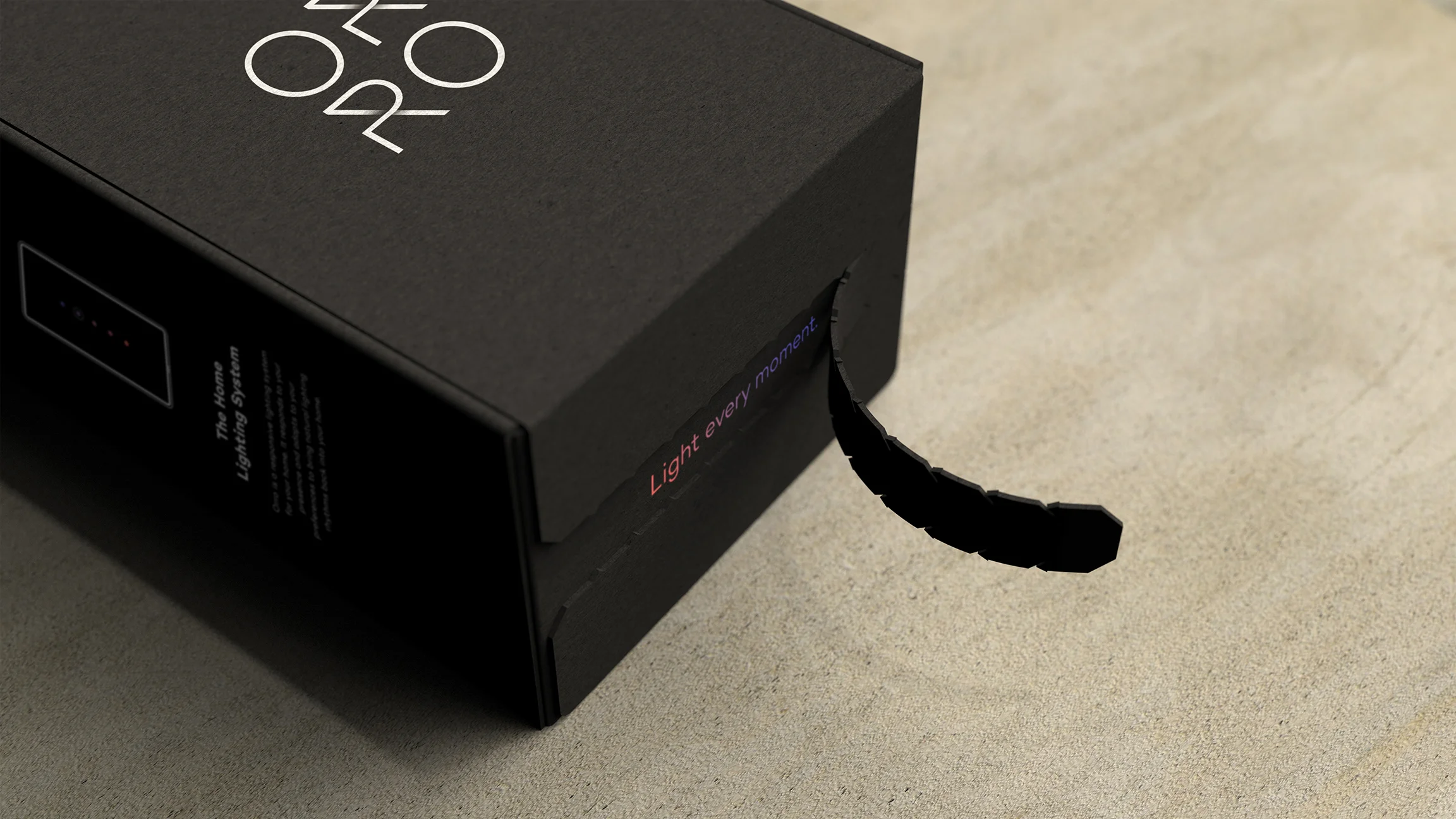
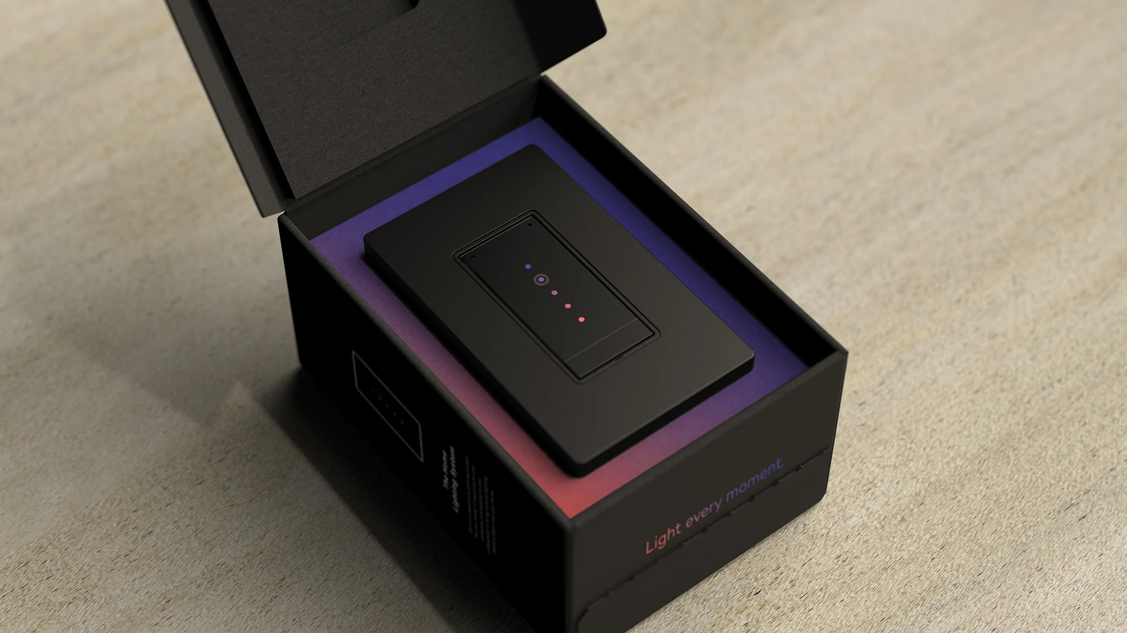
For the brand name, we delved into words evocative of warmth, radiance, and enrichment. Inspired by the Spanish word “oro,” which translates to “gold.” The wordmark is clean and refined, with expressive, subtle gradients signifying the soft changes in natural light. The brand color palette is warm hues that occur in the span of dawn to dusk. We delivered a brand identity, photography and branding guidelines oozing with the glow and warmth to match Orro’s expressive aesthetic.
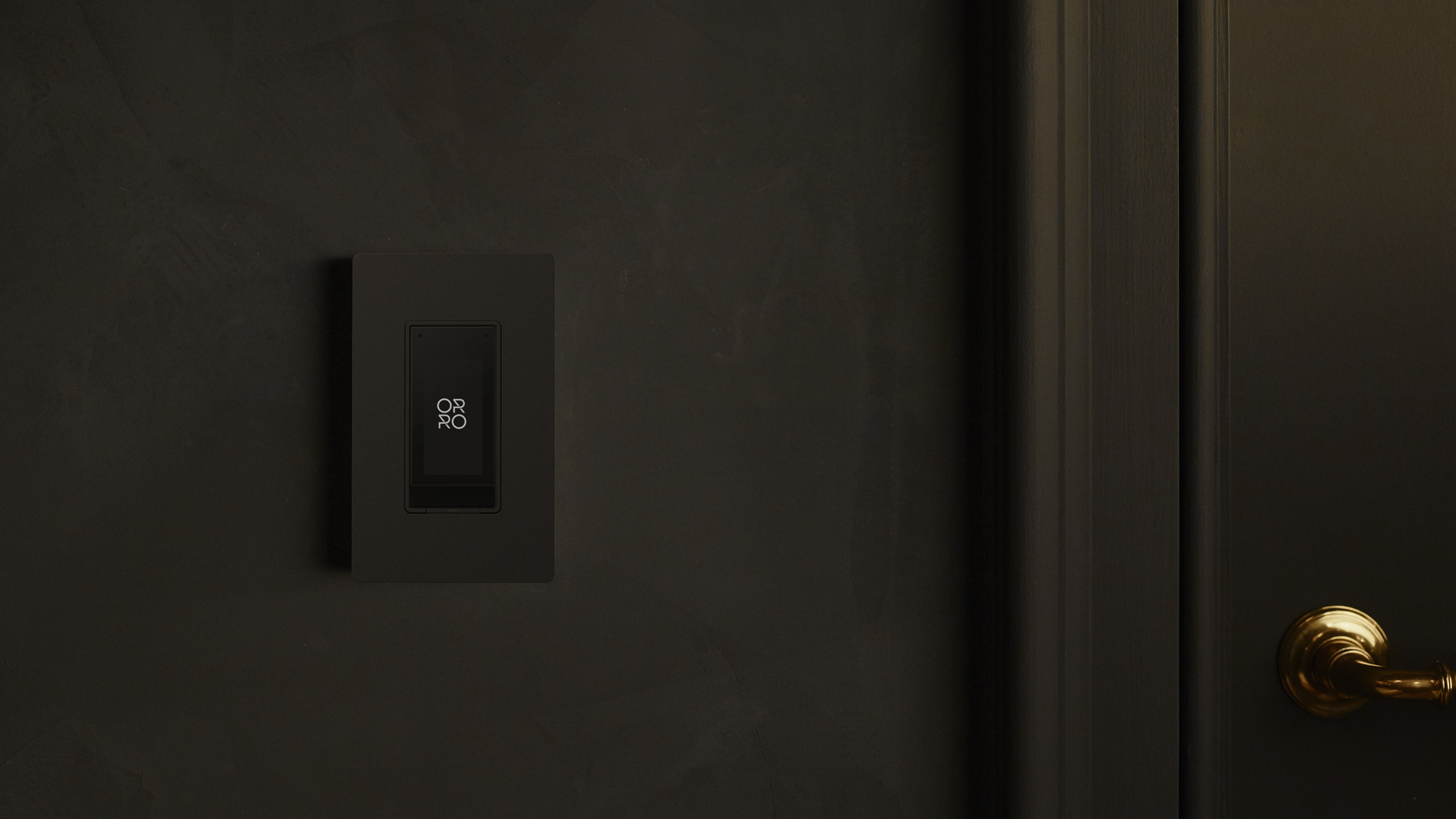
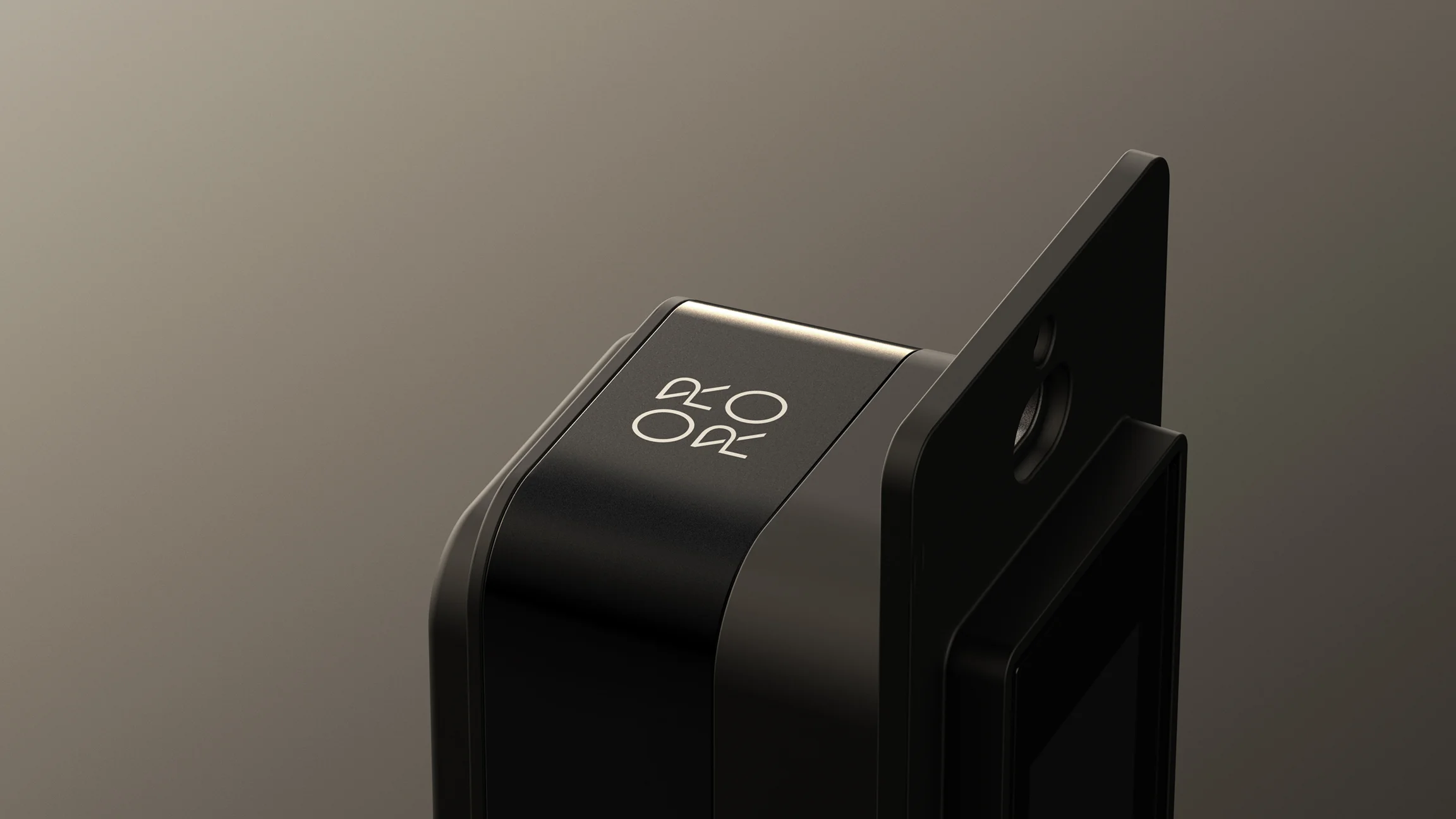
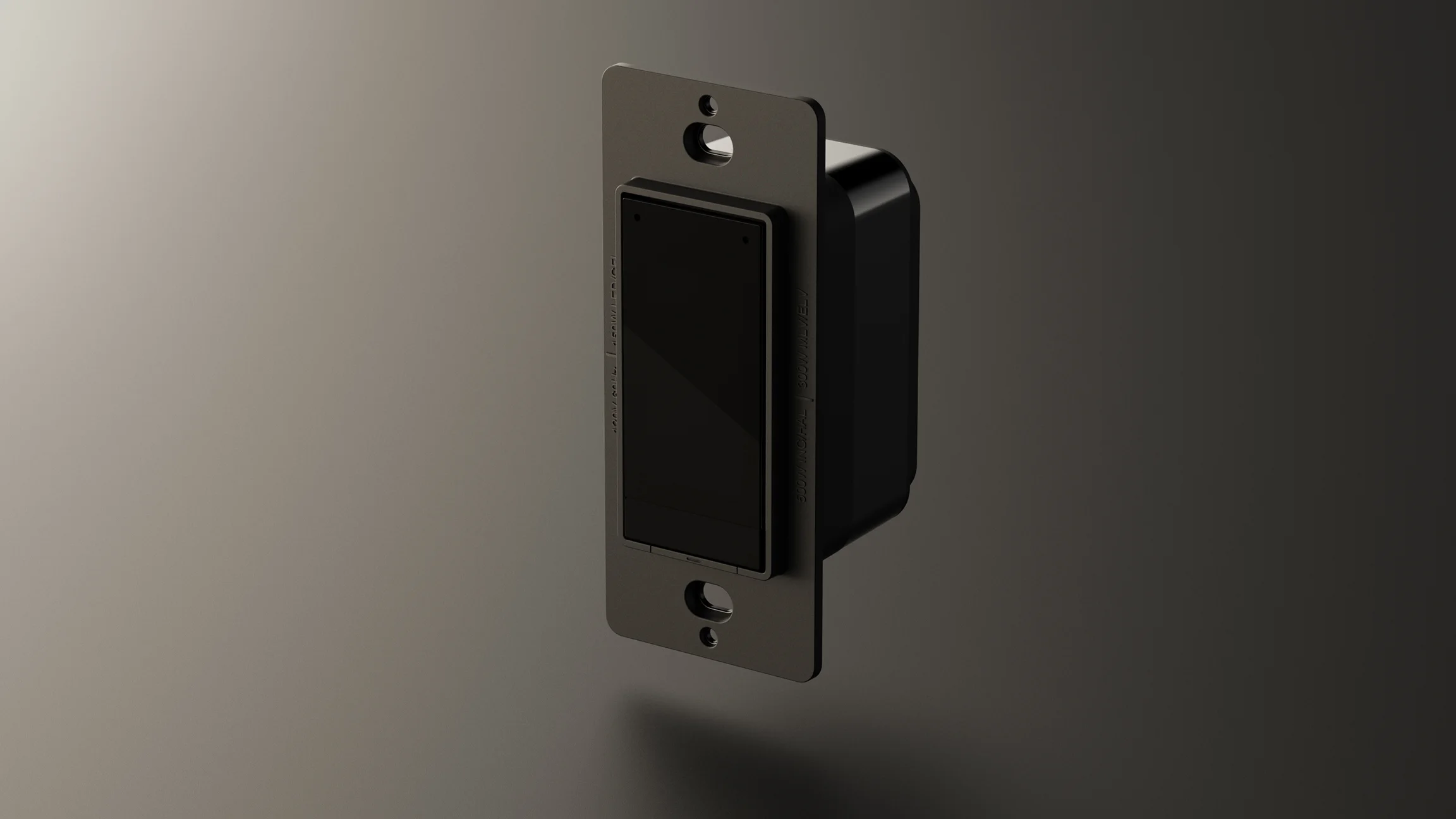
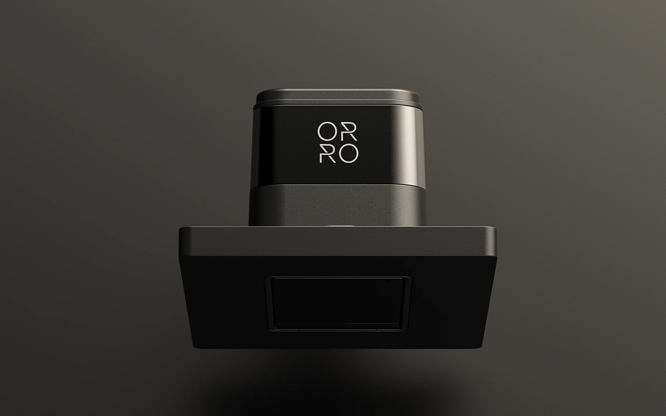
The switch itself is simple and elegant with a thin frame and refined, minimal finishes. The robust technology disappears behind the front façade. At touch, it physically toggles like a traditional light switch, allowing anyone unfamiliar with the system to effortlessly use it.
This intuitive usability was a direct result of our close collaboration with Orro’s engineering team. Our design solutions prioritized Orro as a light switch first, while its ability to utilize motion, sound, proximity and light sensors, as well as connect to existing home IoT services, feels secondary and delightful. With refined metals and a beautiful, fully considered body design, the entire product—even the back which sits inside the wall hidden from view—feels thoughtfully designed from the minute of unboxing.
Orro launched in January 2019 and is currently available for beta testing.