Bose: Designing the Power of Sound
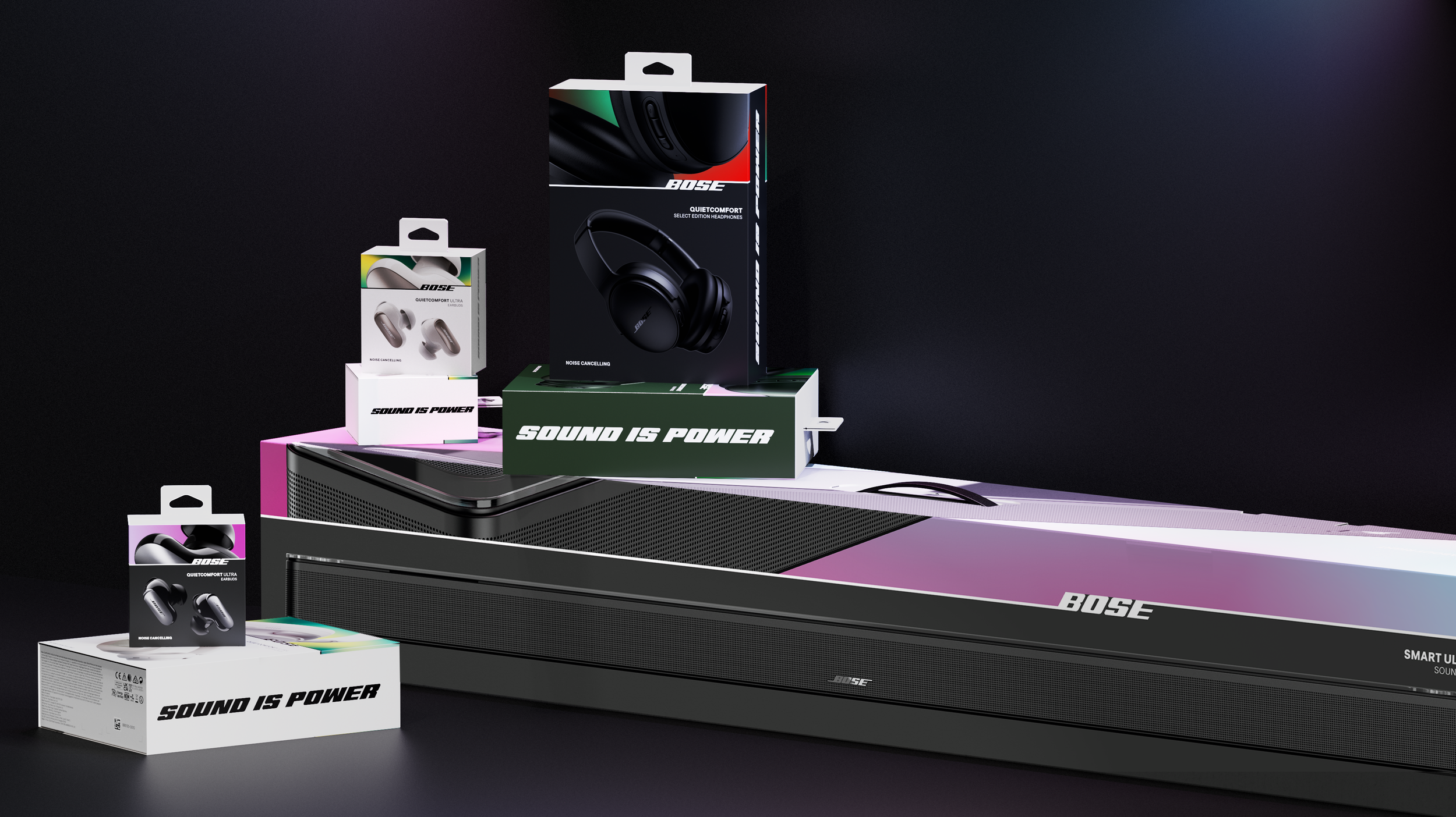
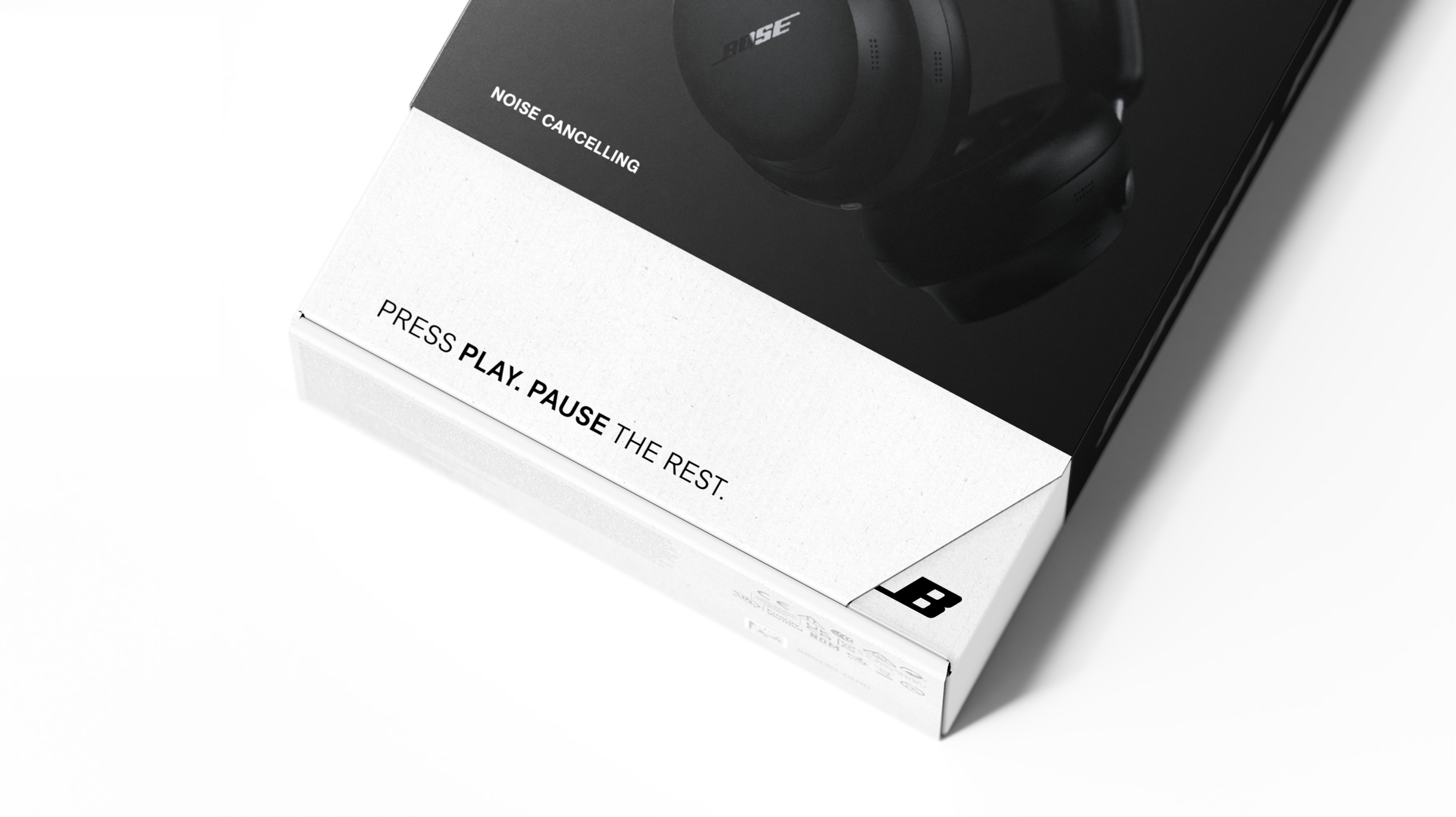
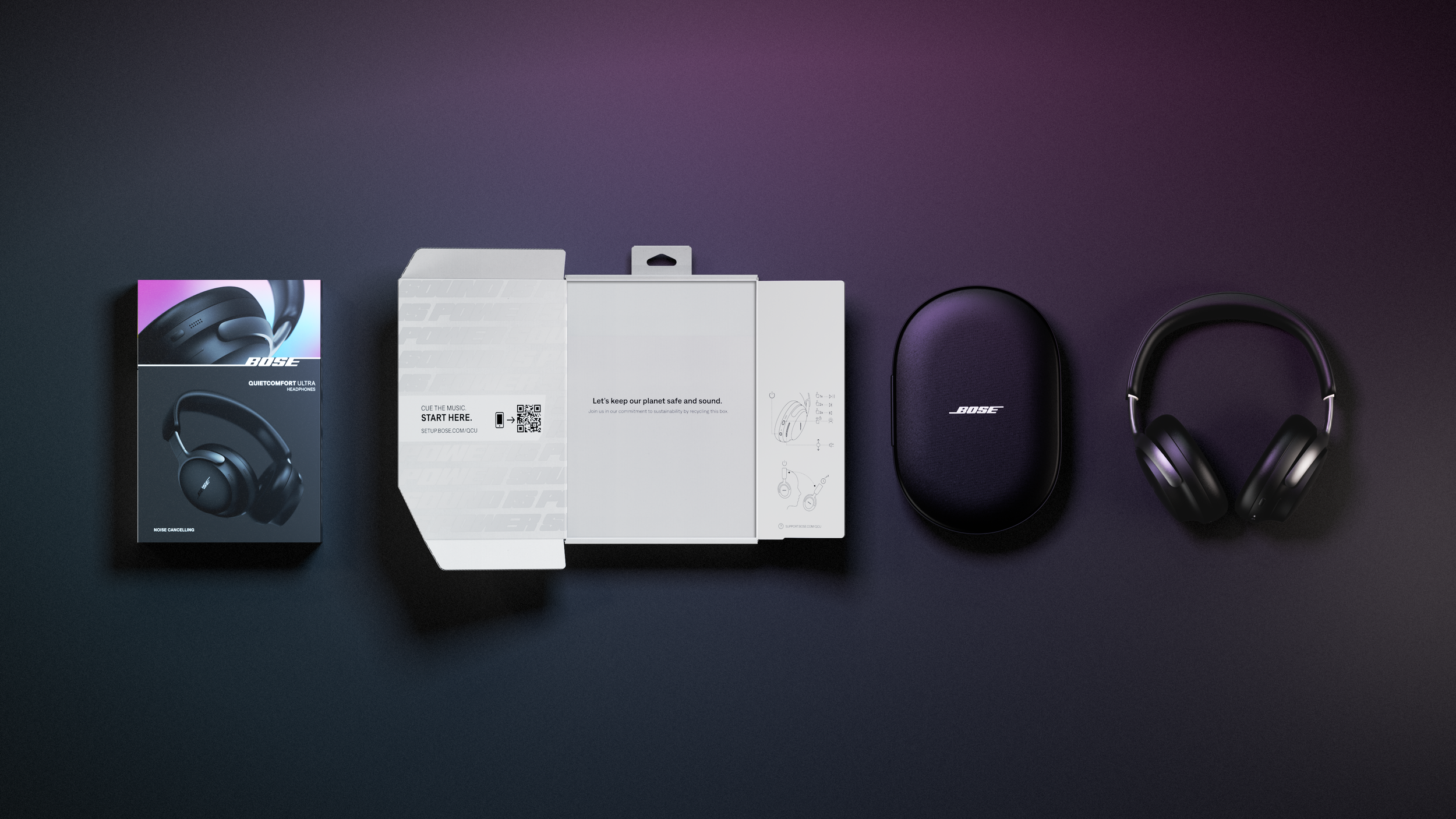
Enlisted was tasked with a retail-ready packaging redesign for Bose, a renowned leader in premium audio. This project stemmed from the need to adapt to evolving consumer behaviors, business requirements, and the updated Bose identity. Our scope included both structural and packaging design systems that would effectively deliver an exciting out-of-box experience (OBX), showcase the product, be environmentally friendly and extend to the entire Bose portfolio.
CHALLENGE > APPROACH > RESULTS >
SERVICES
Structural Packaging Design | Packaging Design | Product Visualization | Messaging | Print Production
INDUSTRY
Consumer Electronics | Wearable Tech
CHALLENGE
Harmonizing Packaging Innovation and Sustainability
The overall program objectives were to improve sustainability, lower bill-of-materials cost, and express the brand’s refreshed identity.
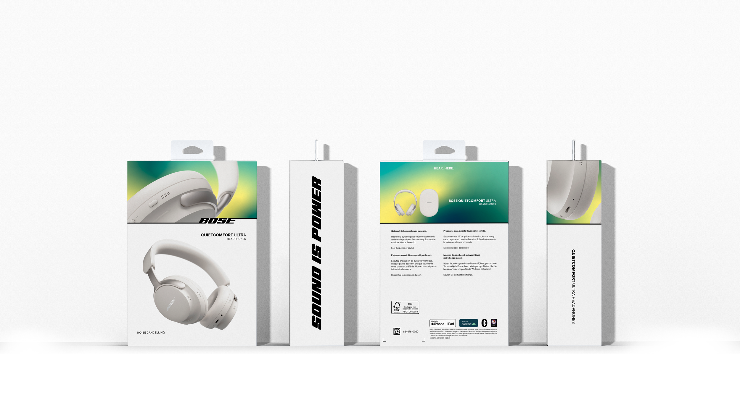
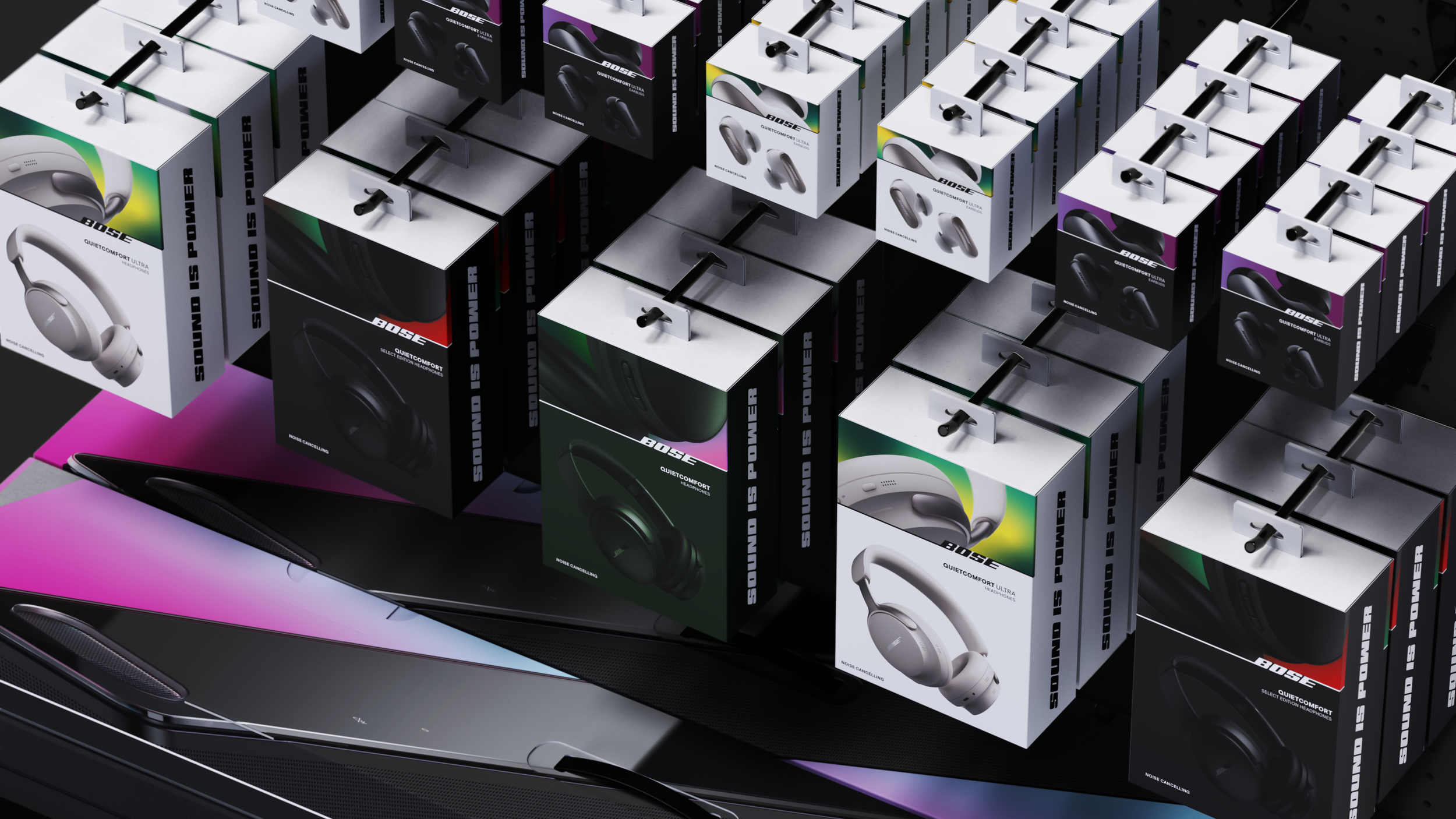
The structural packaging design challenge was to find the right balance between delivering a craveable unboxing experience, being sustainable, and maintaining price point. The goals of the visual design language were to make a lasting impression in a crowded retail landscape and express Bose's reimagined identity, ultimately turning up the volume on shelf.
APPROACH
Orchestrating Innovative Design Solutions
We immersed ourselves in the competitive landscape with store visits, gathering invaluable insights to inform our approach. We initiated the creative process with sketches and iterations that centered on the unboxing experience. Once the OBX was refined, our focus shifted to construction and materials. We explored an array of structural solutions in our program, ranging from telescoping rigid boxes with molded fiber trays to innovative combinations of paper and fabric elements. In the end, we crafted a premium corrugated carton that felt like a rigid box without the costly price tag.
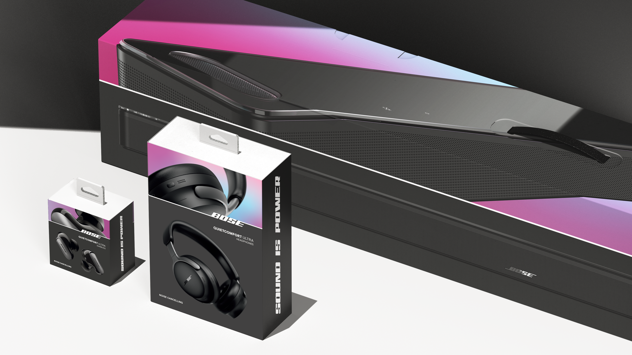
To tackle the visual challenge, we embarked on a collaborative journey with Bose's brand and marketing teams, workshopping together from initial concept sketches through final print mechanicals. Consideration of future product roadmaps and product tiers was key in creating a comprehensive design system that would stand the test of time. Our explorations ranged from harnessing existing brand assets to introducing new elements like the 4th dimension graphic treatment, embodying the brand persona—visionary, courageous, engineered, passionate, and magical.
RESULTS
Leveling Up For A Global Audience
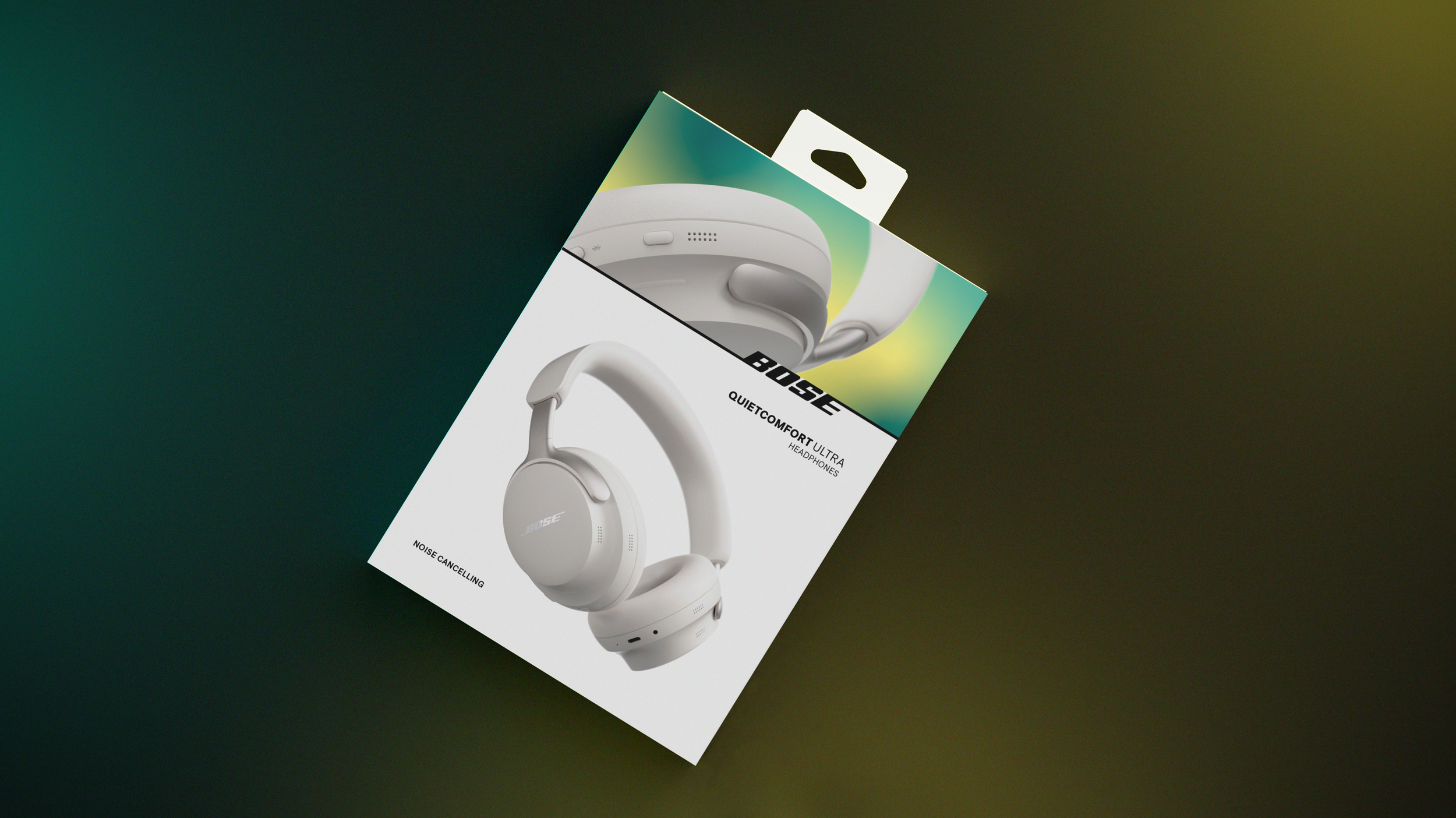
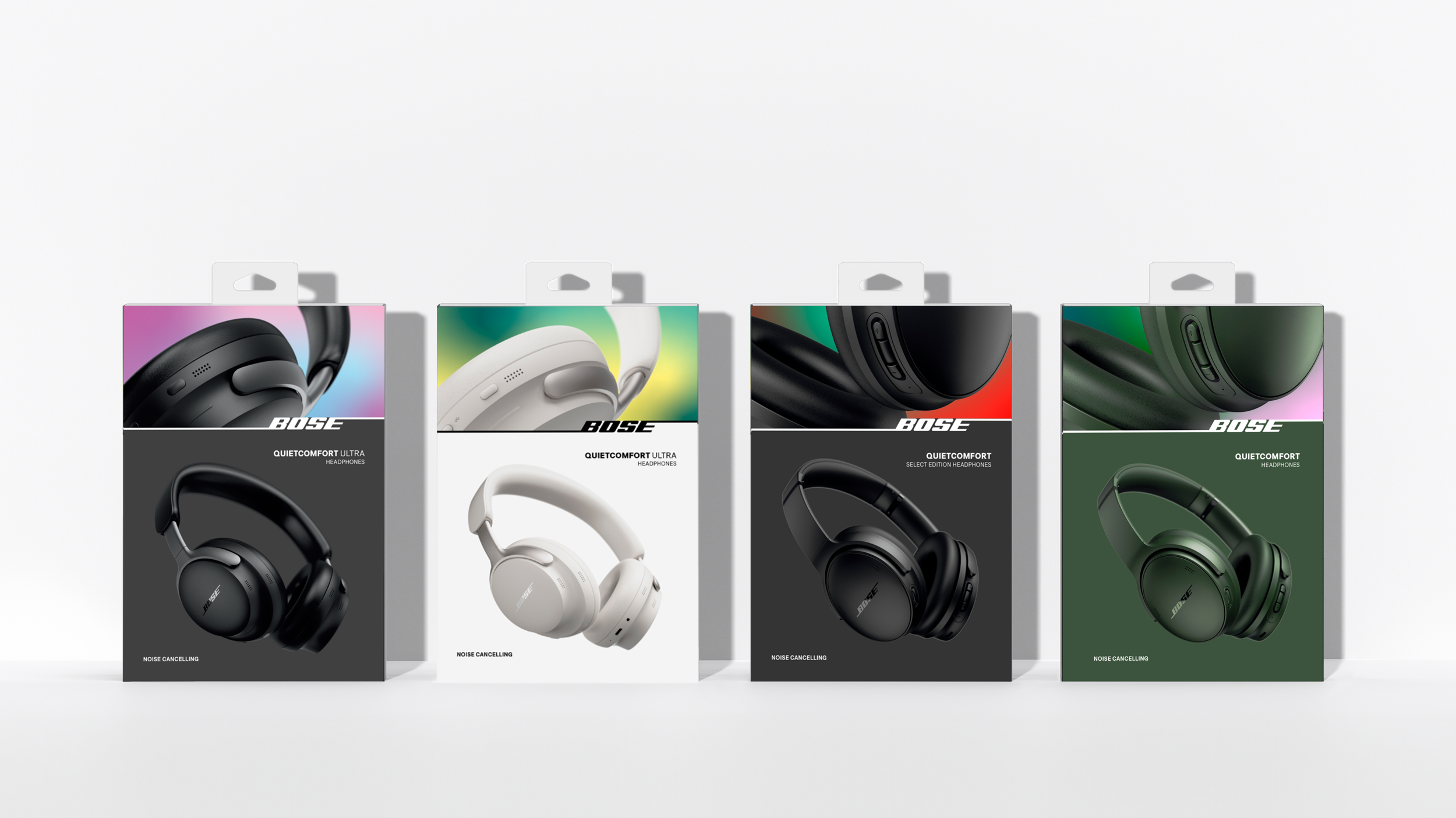
This new visual design language and packaging system now physically reflects the consumer perception of and aspiration for the Bose brand. It appeals to a wider demographic, extending a warm welcome to the next generation of Bose customers. Bose rolled out this new design language across their QuietComfort and QuietComfort Ultra headphones, QuietComfort Ultra Earbuds, and Smart Ultra Soundbar. The redesigned packaging introduces a fresh language that not only enhances SKU differentiation and amplifies the brand's on-shelf presence, but can also seamlessly complement other marketing collateral.
Packaging render visuals on this page represent design-intent.

