Perdue: Standing Out From the Flock
Perdue is one of the country’s leading poultry companies. After breaking with industry standards to revolutionize their animal care practices and commit to all-natural products, the iconic American brand was in need of a bold logo and design language refresh equal to their progressive values.
CHALLENGE > APPROACH > RESULTS >
SERVICES
Packaging Design | Brand Identity
INDUSTRY
Food & Beverage
CHALLENGE
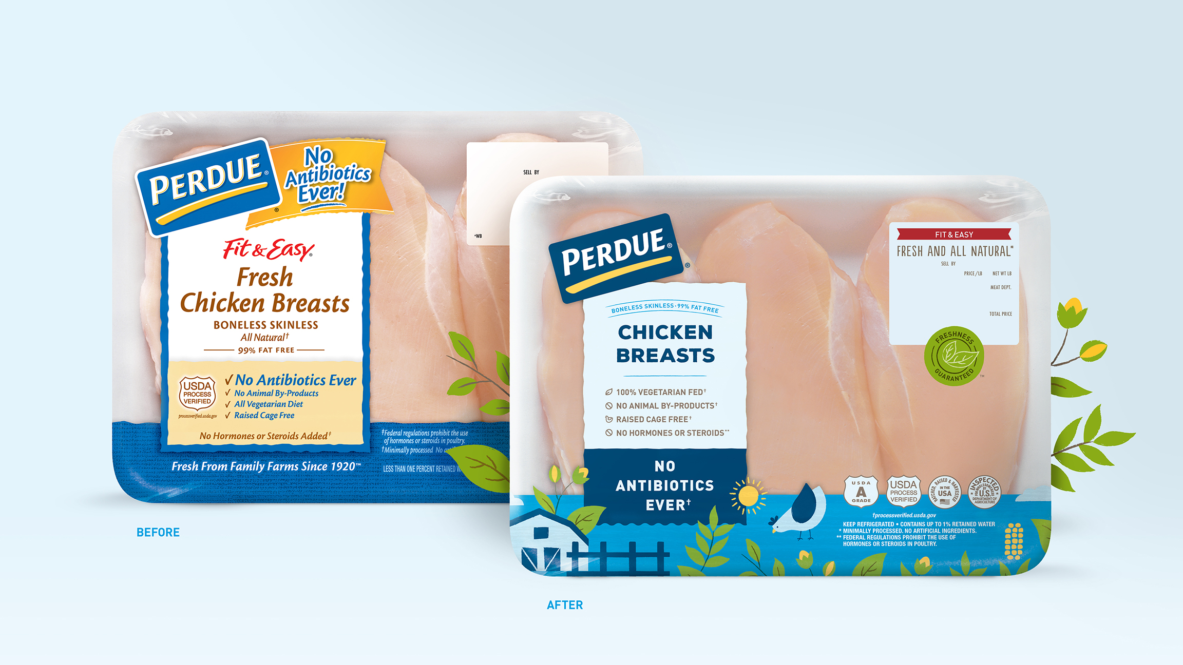
Modernizing an iconic brand
It was critical for the new design to go beyond what’s expected of typical mass Consumer Packaged Goods (CPG) brands. Perdue had to feel modern and natural in order to emotionally connect with younger generations — a demographic likely to be unfamiliar with the legacy brand but care deeply about humane farming. Changes needed to feel authentic to these new customers, but also preserve existing customer loyalty.
APPROACH
Radical research
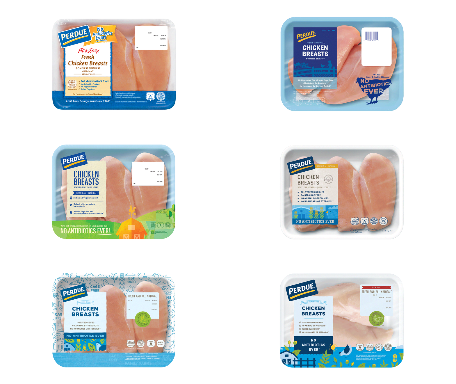
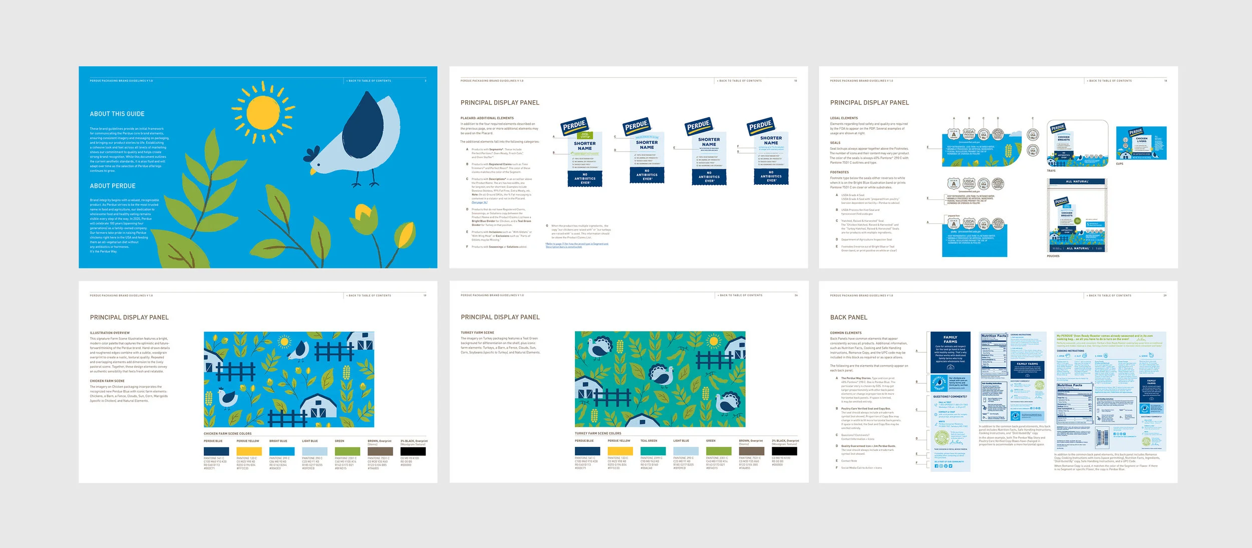
We started by immersing ourselves with the Perdue team to uncover the brand’s voice and vision. Extensive farm visits, grocery store visits and qualitative and quantitative consumer testing followed, guiding our process as we refined and honed a design language system able to deliver on the new Perdue brand promise.
RESULTS
Bright and bold
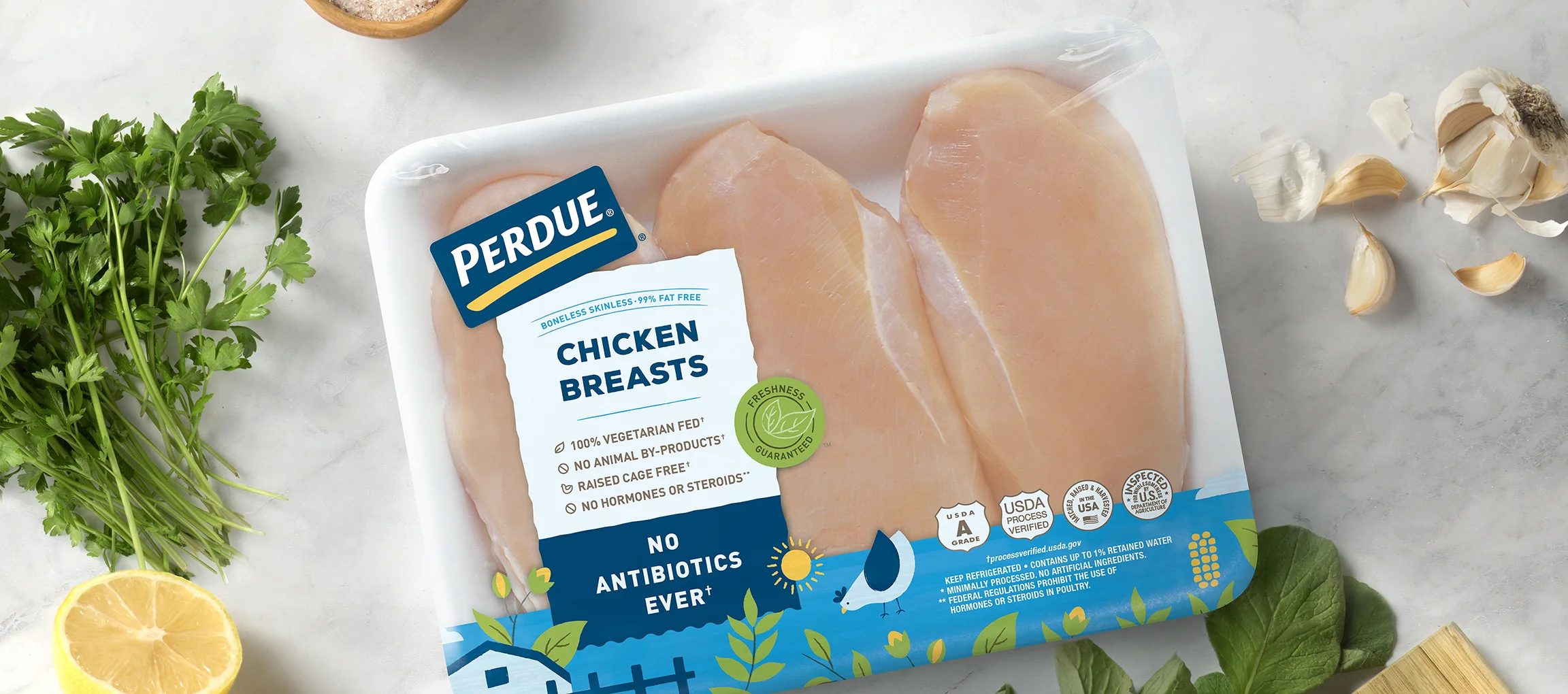
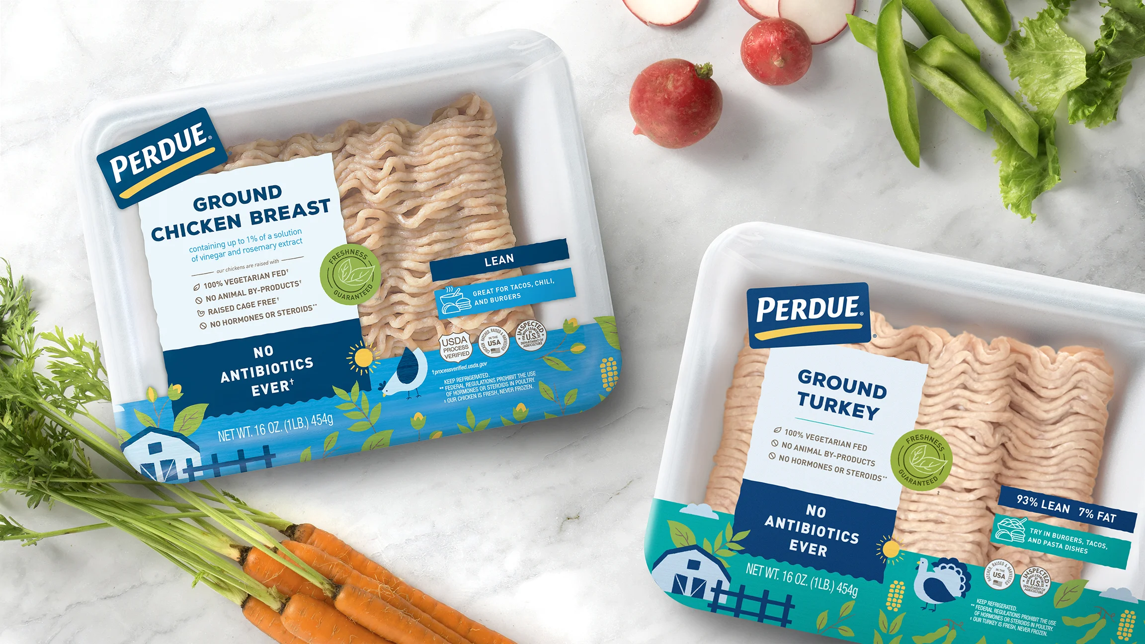
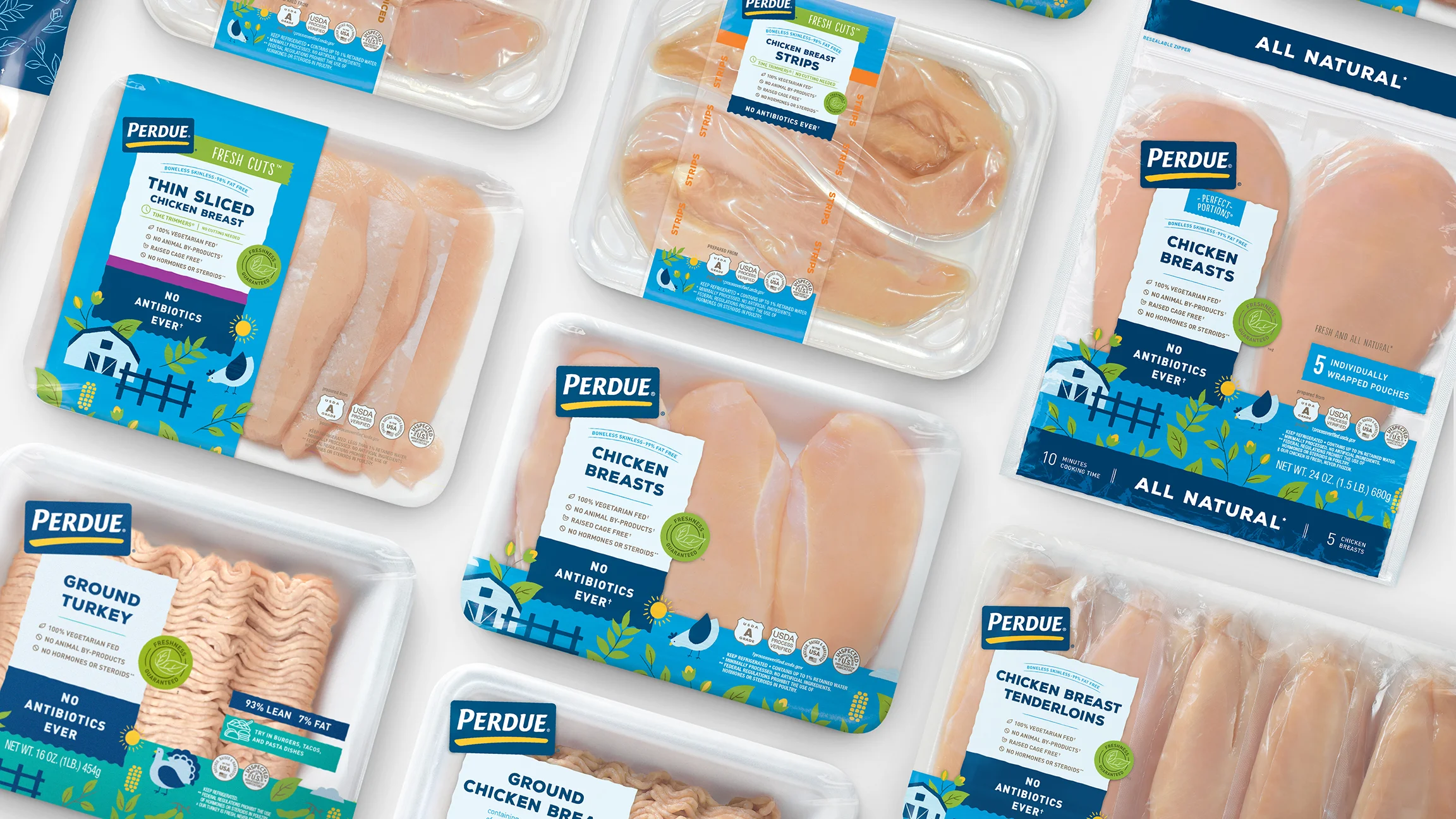
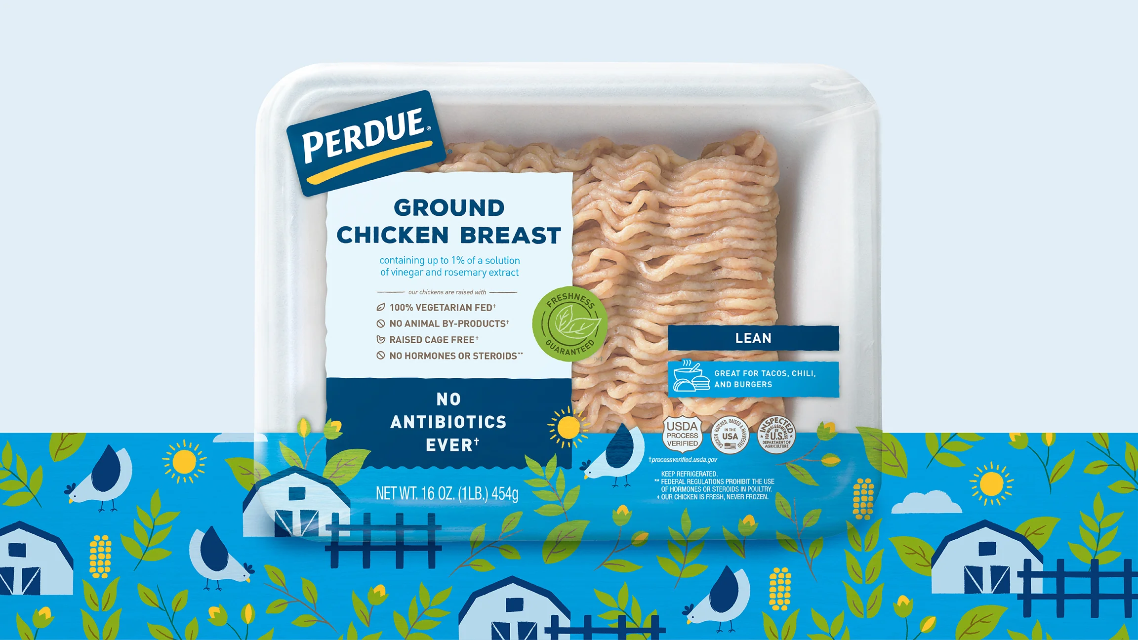
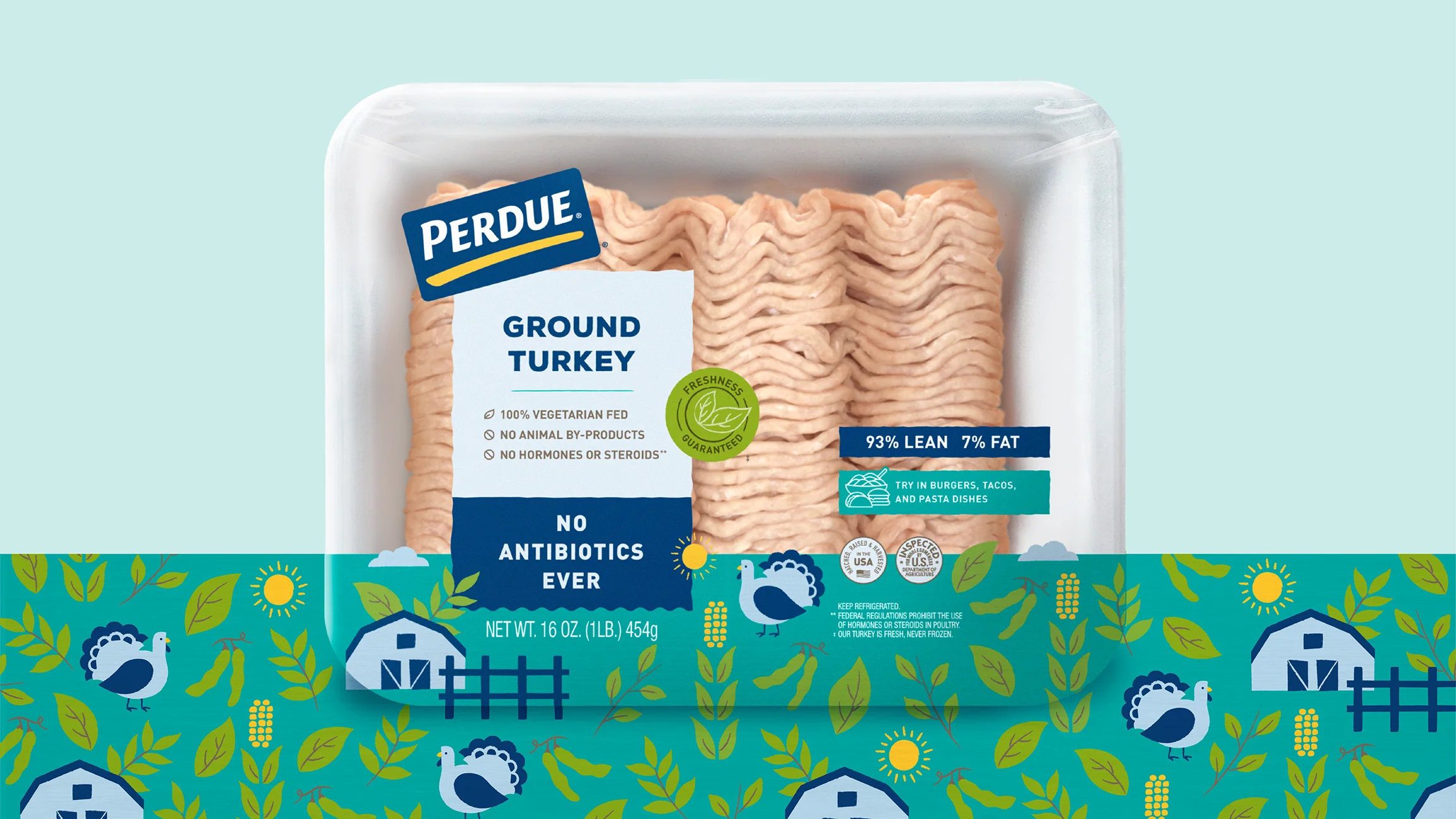
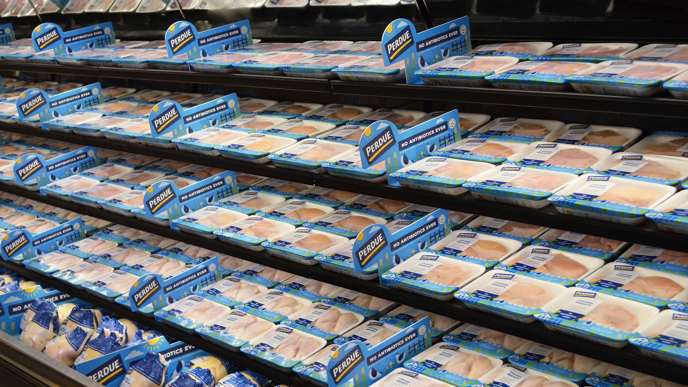
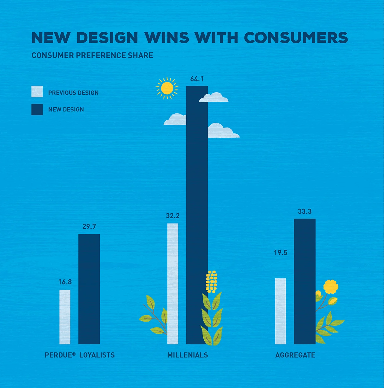
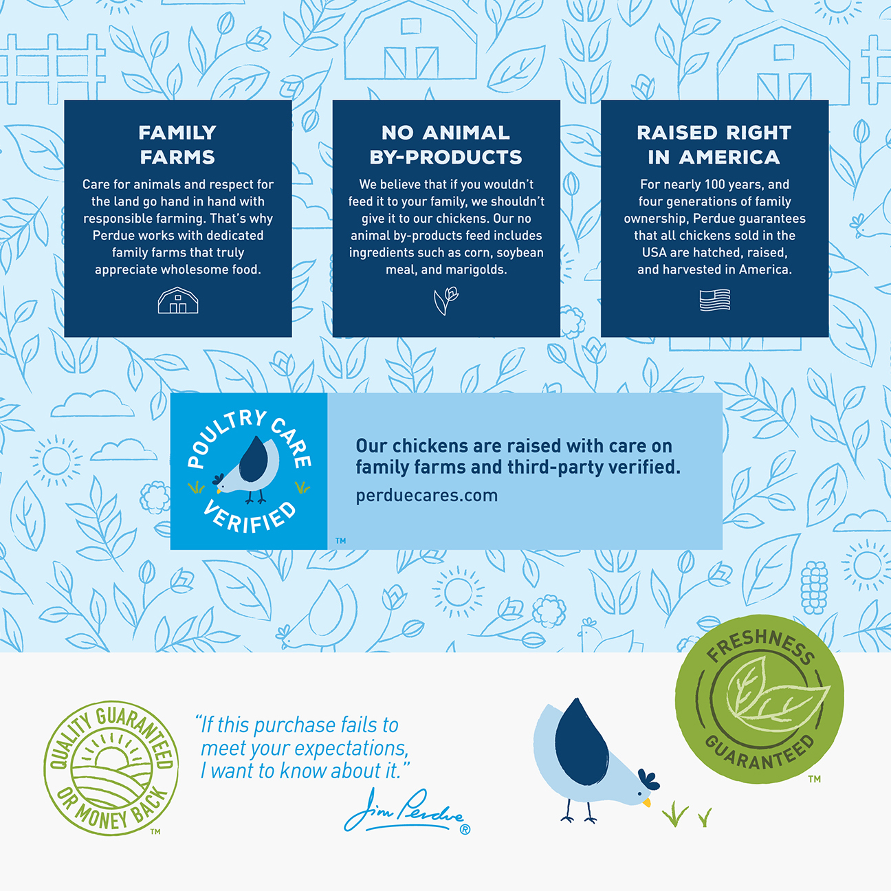
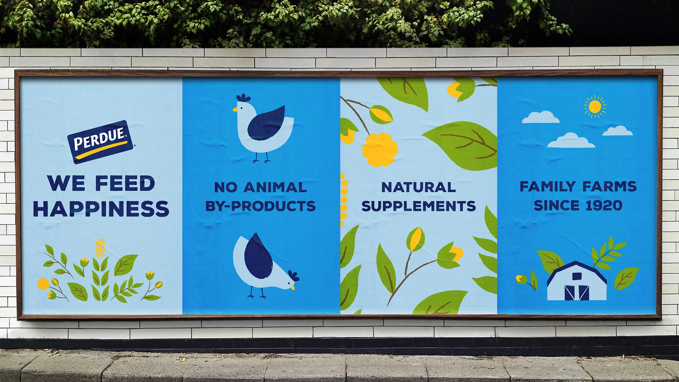
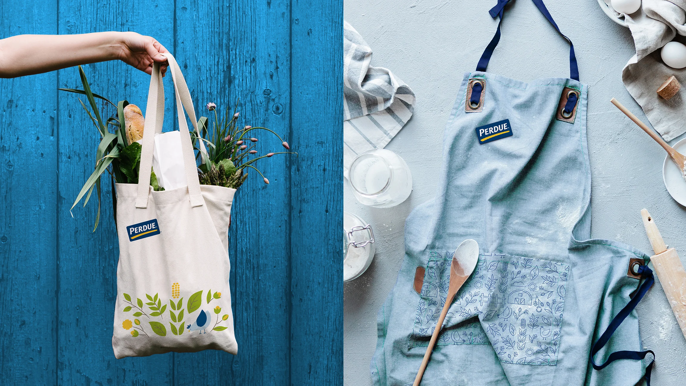
Through collaborative effort, we designed a brand that captures Perdue’s bright and future-forward vision with modern farm illustrations, vibrant color, and bold-meets-minimalist typography. Launched in September 2018, the rebrand is a win with millennials and existing customers alike.

